
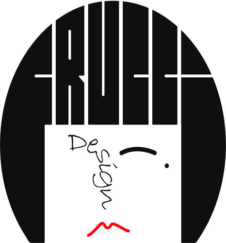
About three years ago I design the logo for Frucci Design.
The idea came combining some of the things I like:
Drawing, Multifunctionality, Photoshop/Illustrator, Matisse, My Hair Style (here I must spend few more words, I have had the same hair style since a was a little girl, surely I did change it especially during my 20s, I once was suicide blond, but I always go back to my black bob).
One day I started drawing a very simply self-portrait and I decided to do it using Illustrator (this is my way to learn new tricks with this kind of software), and I don’t even know why I started fitting letters into what it was suppose to be my hair…and all of the sudden they really made sense and FRUCCI DESIGN’s logo was born. And to this day, I find very interesting to see people reactions to it, some only sees the name placed in a funky way other only the shape of the bob but no letters.
During these three years Frucci Design has grown and I now feel it’s time for me to start using a maker’s mark on my metal work and most importantly my real name initials FV. The other day I found myself once again opening a new Illustrator file. After few sketches I decided to adapt the old logo (which is not really suitable for a tiny mark) to my name initial.
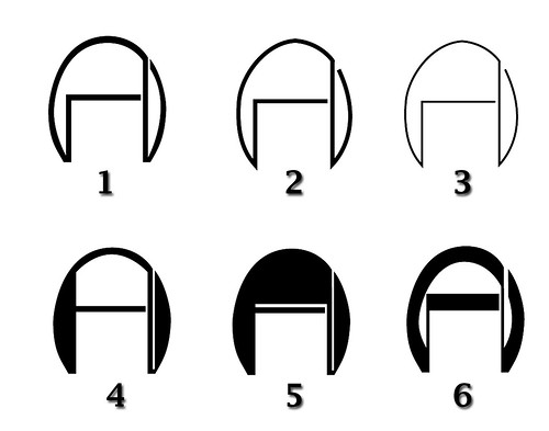
Now I have to decide and I need your help! Which of these six options do you prefer?
To cast your vote please write your favorite design number in the comment section. Keep in mind that the final design will be made in to a tiny stamp probably 1/16" x 1/16" (1.5mm x 1.5mm).


7 comments:
I vote #5. I like the art deco look of that design. Really tight designs.
I have always had a bob too, blond though. I tried going really short, but I'm back to the bob. I guess I need a new photo!
I like #5 too for the art deco, bauhaus feel. I also like #3...it reminds me of the folds in the paper that you make.
keep it simple, 2 or 3.
I'd go for 2 perhaps. the lower row is too complicated for a hallmarking stamp. keep that for any other corporate stuff like labels and letter heads and what not. for that its cool.
I'd vote for either #2 or #5. Since your stamping metal with it, perhaps #2 will produce a clearer image? That would be my guess. Not sure though.
My preference, in order:
5
1
2
Baci e abbracci!!!
Michela
^^)
ora si. Ho letto tutto il blog.
#6
Hi
02 and 06
:)
Post a Comment